
Colour contrast takeaways: UX Scotland
I recently attended UX Scotland and one of the sessions I found really useful was Roger Attrill's head-scratching but informative talk on colour, visual contrast and accessibility.
Roger started out explaining why, as designers, we use colour and what potentially could go wrong when we make choices.
Typically, as designers with some knowledge of web accessibility, we turn to the WCAG 2.1 guidelines to help us make those choices. Problem solved, right?
Well, the short answer is … no!
Roger highlighted the example below from Twitter. The colours are on brand, beautiful even. However, when we use our contrast checker, we discover that the colour contrast is a no-go against WCAG ratios.
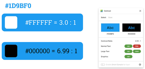
You’re about to complain that the blue and white combo can’t be used for text and that a black and blue combo has a much better contrast of about 7:1.
But something stops you because something weird is happening. You’re finding the white on blue easier to read than the black on blue. What’s going on? The numbers are very clear – black is way better than white – and the numbers don’t lie, but your eyes are not so sure.
The guidelines and algorithms to determine colour contrast are set to change in an upcoming version 3.0, although that is still potentially a several years away.
As part of this major overhaul, a new contrast algorithm is being developed called the Advanced Perceptual Contrast Algorithm (APCA). The key feature of this new contrast algorithm is that it takes into account the way that the human vision system perceives colour, in particular on self-illuminated displays (or ‘modern’ screens).
Checking the colours again in the APCA, surprisingly the contrast compliance is completely reversed. With the APCA model, it turns out that white is better on blue after all:
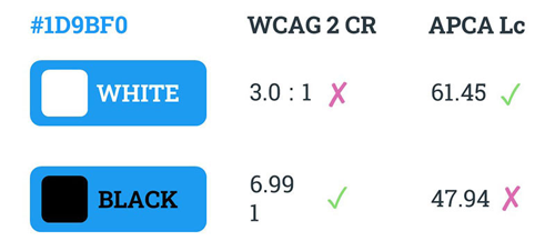
The WCAG algorithm doesn’t account for real human perception of colours, whereas the APCA algorithm does. Right now, we can’t all start using this new tool because WCAG 2.1 is still the current specified standard in the UK's Public Sector Bodies Regulations, as well as in equivalent legislation in USA and Europe.
In summary, it’s still a bit too early to completely switch our tools. It’s neither practical nor desirable to go back and fix all the work we’ve done before, and for a while, many of us aren’t going to be able to improve things going forward either.
But it does allow us to start to plan for the future.
For non-public sector projects, could we perhaps consider using both ratio models alongside real user testing with people with visual disabilities?
The people behind APCA have also created a tool called Bridge PCA. It’s 'backwards compatible' with WCAG 2 in terms of the range of the contrast ratio. It provides the more modern APCA contrast ratio that also passes WCAG 2.1 values.
Another tip Roger shared was to experiment with human-friendly colourspaces like HSLuv.
When you adjust the hue or the saturation, you get a colour of the exact same contrast. There are some downsides in that the range of colours in these colourspaces don’t include all the colours you can find in your RGB or HSL colourspaces, but it is another tool designers can use to help deliver accessible experiences.
Read more about the key themes from Jim's visit to UX Scotland in his follow-up blog here.